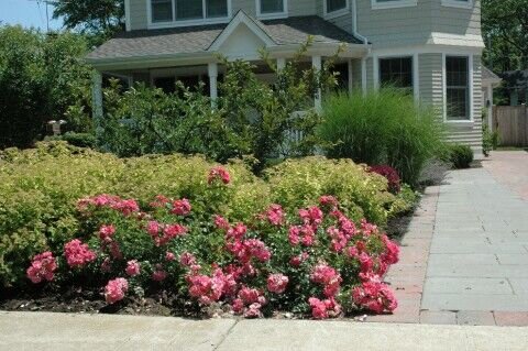
Texture is an important element of what makes a landscape especially beautiful. To balance textures within your landscape, here are some landscape design ideas that utilize different textures in Northbrook, IL.
Everything you see in your landscape has texture. Consider the smooth river rocks in a water feature, or the roughness of stacked flagstone retaining walls and the wispy softness of ornamental grasses. There’s also the waxy smoothness of boxwood leaves and the subtle flagstone texture of patio pavers. We can all feel these textures, but texture can also be seen. Visual texture relies on the interplay of light and shadows to provide depth, contrast, definition, and dimension to various landscape elements.
Related: Find A Laying Pattern That Shows Off The Look Of Your Patio Pavers In Lake Forest, IL
Light and Shade
Textures are both visual and tactile. While you can always walk around your landscape and touch everything in it to fully experience the present texture, it’s the interplay of light and shadow that creates visual texture. You will notice that textures are more pronounced in the low light of morning and evening. You can mimic this drama after dark and emphasize texture with creative placement of landscape lighting that brings attention to the texture of tree bark, masonry elements, or water features.
Drawing attention to textures doesn’t necessarily mean drawing attention to landscape elements with the most texture (such as a stacked-flagstone wall). You can emphasize subtle textures to create a soothing setting. Since light and shadow make objects and plants appear more textured, shade is an important way to minimize texture. You could have a shaded area created in your backyard, either with a grouping of trees or a permanent shade structure like a pergola, to diffuse light and minimize textures to add tranquility to your landscape.
Bold Contrast
Contrast helps draw the eye to individual elements and brings attention to the visual texture of each element. For example, pair fine elements such as wispy decorative grasses with bold elements like a grouping of boulders. Contrast square oversized paving stones with the softness of a mossy groundcover. Plant bright, cheerful flowers against a backdrop of dark evergreen shrubs. Or surround a rectangular pool deck with a curved masonry retaining wall topped with lush hanging foliage.
Visual Weight and Balance in the Landscape
Every element in your landscape exerts a visual force that attracts attention. The greater the force, the greater the attraction. This “visual weight” acts like a magnet to the eye, which is how an otherwise unassuming landscape element such as a tree can either be part of the whole (such as when trees are grouped where it doesn’t draw attention to itself) or a focal point such as a solitary tree in a sea of grass.
Textured elements appear to be heavier than smooth objects. This is because texture enhances an object’s three-dimensional presence, which contributes to the appearance of mass and physical weight. Visual weight makes an object more prominent, and this draws even more attention to its texture.
This effect can be approached in two ways: emphasize the texture to create a focal point, or balance it with other elements to tone down the visual weight and texture. Balance the visual weight of an element by adding more “lighter” elements grouped together in a given space. The viewer will perceive a single larger element as equal in “weight” as a grouping of smaller/lighter/less textured elements.


